156 posts tagged with "features"

View All Tags

Displaying clients on map

· One min read

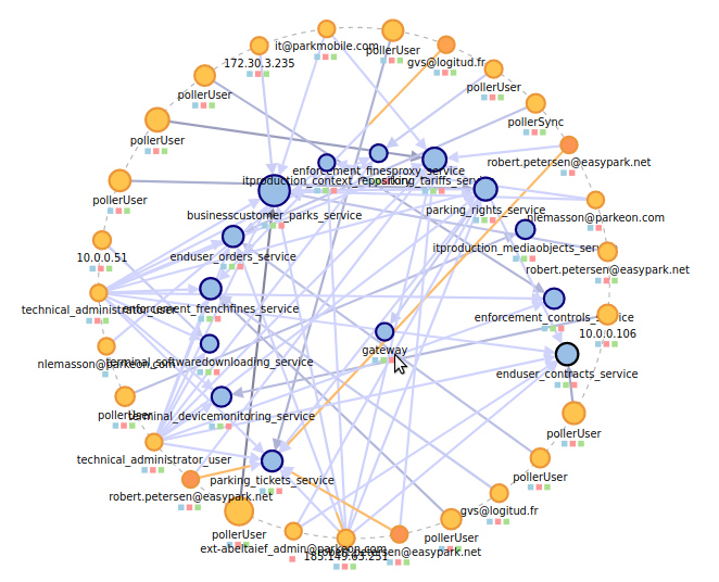
This week brings several improvements in how clients are displayed on map:

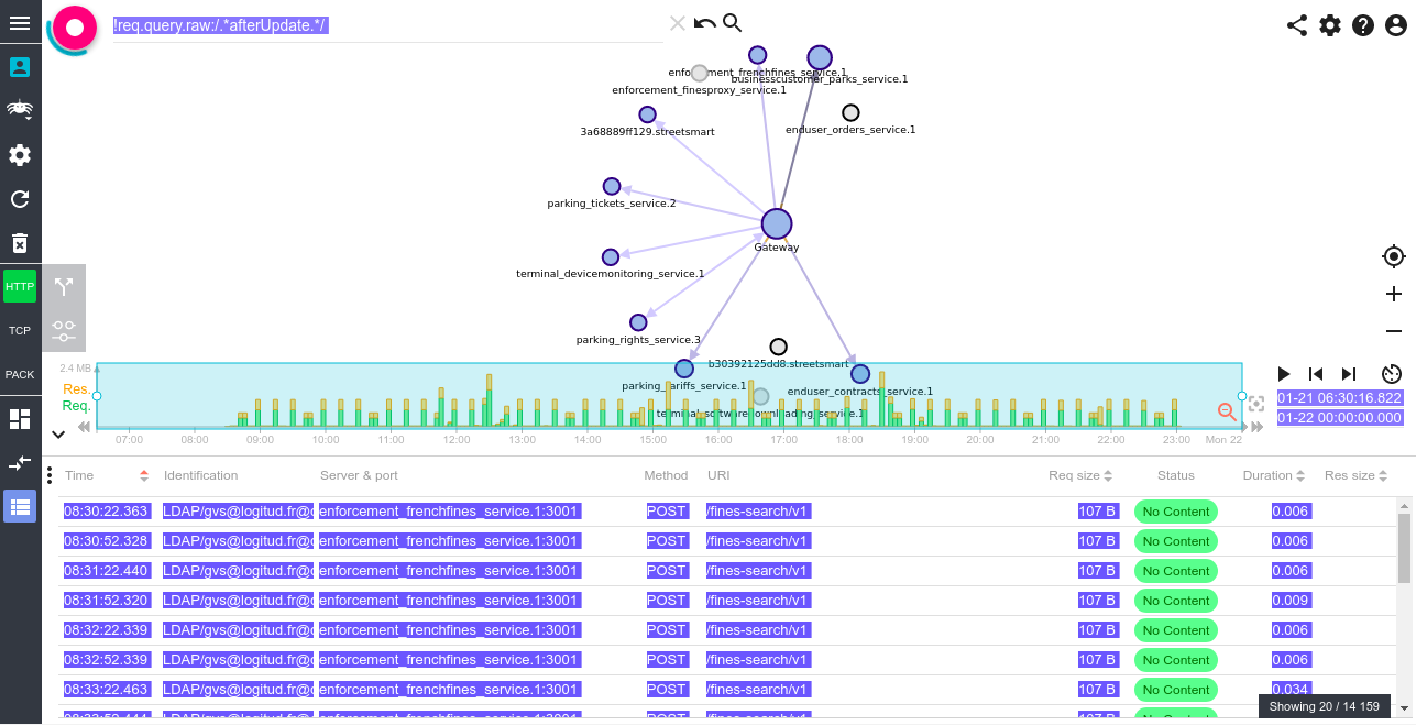
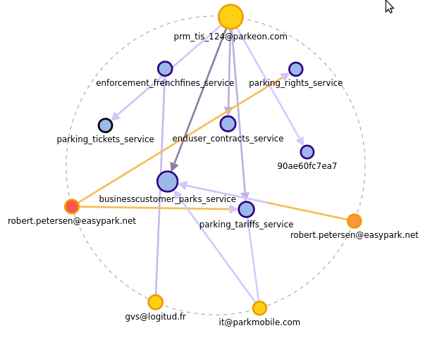
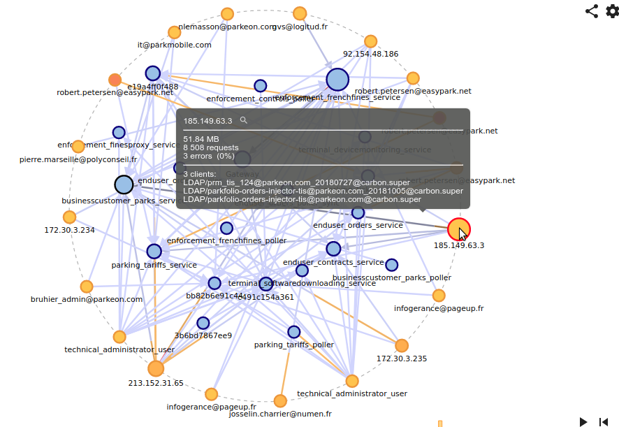
Specific color for clients​

Clients are now display in a yellow/golden color to be visually different from the servers' blue. As for the servers, the golden color is shifting to the red depending of the percentage of errors.

Show list of identifications in client tooltip (HTTP view)​

All identifications used by a client are listed in the Node tooltip on the map (up to 20).

Name clients based their identification (HTTP view)​

Clients that have only one 'identification' are displayed with their identification when their is no DNS name associated to the client. This name is compacted using a regular expression that can be customized in the settings panel.

Move clients to an external ring (option)​

When activated, a ring is drawn outside the server cluster, and all clients are migrated to it to clear the view.
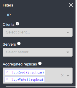
Filter on Aggregated replicas

· One min read

You may know had filter to aggregated replicas directly from the filters list. Previously, it was only possible to do this on the map, and you could not selected several of them.

Do you want to see all instances of this and that server? This is for you!

Global settings tab

· One min read

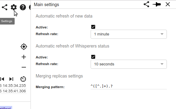
A new global settings tab has appeared. Its role is to gather and offer change on the configurable processes of the UI. For now:

  • Automatic data refresh
  • Automatic Whisperer status refresh
  • Merging replicas pattern

Merge replicas now applies to Sequence Diagrams

· One min read

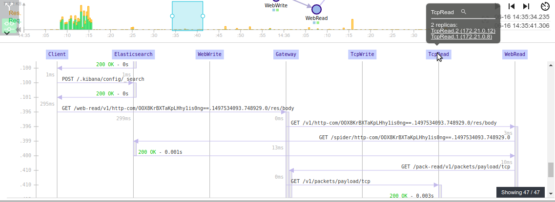
Merge Replicas feature is now also applied on sequence diagrams: all replicas of same application are merge on one actor. The effect is as appreciated as for the map: more meaningful information, less noise.

I also added tooltips to sequence diagrams actors (and open action).

Prevent unwanted user selection

· One min read

When trying to drag nodes or timeline selection with a touchpad, or even sometimes with the mouse, many struggled and activated text selection. That caused nuts on the UI.

I added special CSS stuff to prevent selection on the map, tooltips, timeline and so on. This should be much better.

Example: A Ctrl+A on Grid view.

Quick filters on HTTP map for statusCodes

· One min read

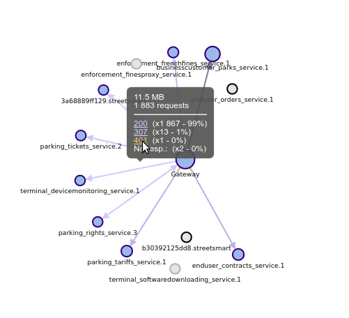
Because it was requiring too many clicks, I added a quick filter feature in the tooltips of the HTTP map: -> Want to see what are the 32 requests with 500 status? Just click ! :)

A link is still missing for request without responses. I'll add it soon!

Merging replicas on map

· One min read

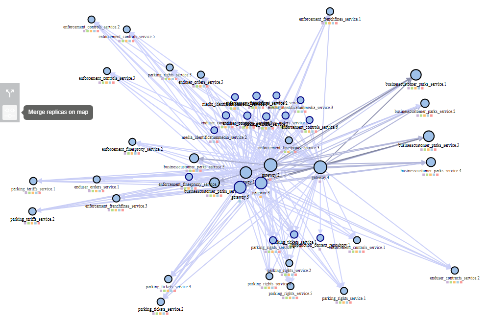
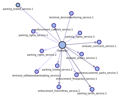
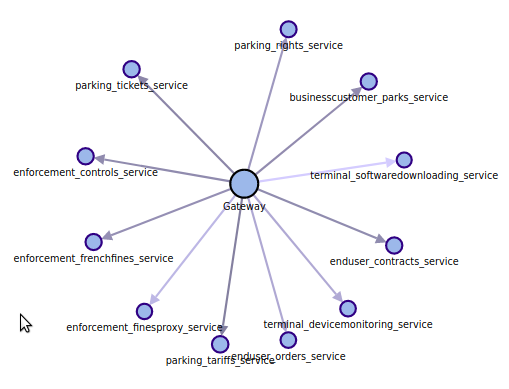
When I saw production map I got afraid. And Allan feedback was on same trend: it is unusable as is. Too many nodes!

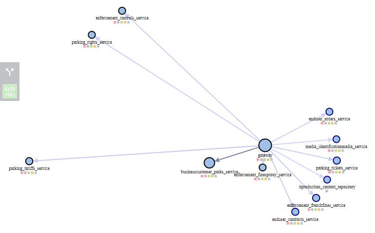
So I reacted quick and here comes a new feature: merging replicas. It is now possible to merge replicas of same application on the map.

Before (note the multiple instance for tickets and rights):

After:

  • This is based on finding nodes with the same 'functional name'.
  • This functional name is extracted from the node FQDN or the node short name with a regular expression
    • Soon to be customizable
    • For now: all characters until first '.'
  • When the option is active, all nodes with same functional name are merged in a single node, but the features stay the same:
    • You can filter on the functional name (all nodes merged)
    • You can filter all communications to this functional name
  • And what's new:
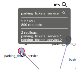
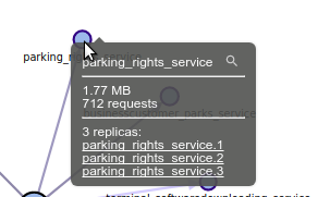
    • You can see how many replicas you have
    • And open the replicas one by one in the host view

Allan, Aless, please send me a screen shot of this feature active on production! :)

Multi Whisperers monitoring

· One min read

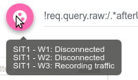
To answer request from Aless, it is now possible to easily track the status of all selected Whisperers, without having to switch from one another:

  • New icon displayed when a group is selected, with the now classic tracking indication:


  • New detail panel showing one tab for each Whisperer status.

Usability increase :-) Thanks Aless!

Reset Time and zoom

· One min read

On request from Alessandro (thanks! :) ), two new features have been added:

Time reset​

As you can play an go in the future, in the past or lost in the middle of nowhen, I added a new button left of the timeline to reset time to the min/max of the current selected Whisperer(s).

I'm not satisfied with the color, i may change soon ;-)

Zoom reset​

Using Spider with a touch trackpad can be difficult for zoom and pan on the map. A quick help has been to change the behavior of the 'Center map' button that now reset zoom level as well.

Time limit in the future​

You may now go in the future (many asked for it). - This is useful not to have to change the selected time to get real time communications.

However, for sake of usage I limited the future to current end of day (local time).