Redesigning Spider's UI
Spider's interface has been with us for a while. It worked well — but the left sidebar navigation, dense filter panels, and compact top bar had started to feel dated. After years of incremental additions, the time was right for a proper rethink.
The result is now live as the default. Here is the story of how it got built.
The goal
The existing UI was functional. It was not beautiful. More importantly, it was not ergonomic for the workflows analysts actually use:
- The left sidebar mixed navigation and filters into one crowded panel
- Switching between HTTP, TCP, PostgreSQL, and Packet views required scanning a vertical icon list
- The search bar was small and tucked away
- Every pixel was used — none left for breathing room
The goal was a fresh, modern look that reclaimed screen space for the data while keeping everything accessible.
Phase 1: Design
The first step was a draw.io session. I sketched out the main layout ideas — top navigation bar, collapsible filters sidebar, expanding search input, tab-based view switching — and produced a mockup that covered the key screens.
The original draw.io wireframe, covering the main views of the reworked UI.
That design was then refined in conversation with both Gemini and ChatGPT. Each brought a slightly different perspective on spacing, visual hierarchy, and interaction details. The mockup went through several iterations before settling on a design that felt coherent enough to implement.
What came out of that phase:
- Top navigation bar — replacing the left sidebar with a flat row of selectors for Team, Data source, and Agent, with view tabs (HTTP, TCP, PSQL, Packet) directly accessible
- Collapsible filters panel — the filter sidebar now hides behind a dedicated FILTERS button; analysts who do not need filters get their screen back
- Expanding search bar — the search input sits prominently at the top and widens on focus, reducing visual clutter when idle
- More breathing room — tighter control groupings and improved visual hierarchy throughout
Phase 2: Implementation in the IDE
Most of the implementation happened inside the IDE, with ChatGPT and Claude in autocomplete and module-generation mode. This phase is the classic AI-assisted coding workflow: write a component, ask for a variant, refine, repeat.
The work covered:
- Rebuilding the top bar component from scratch
- Reworking the filters sidebar into a collapsible panel with its own toggle button
- Restyling the data type tabs for faster visual scanning
- Updating the color scheme and spacing throughout the application
This took a while. The UI codebase is large, the component tree is deep, and many pieces interact in non-obvious ways. AI autocomplete helped with boilerplate and reduced the cost of iteration — but the human was still steering every decision.
One key decision made everything safer: the new layout was developed alongside the existing one, behind a settings toggle. Both styles drive the same underlying React components — the data grid, the timeline, the details panels, the filters. The layout shell changes; the internals don't. This meant the new UI could be deployed to production continuously throughout development, with users able to switch back to the old style at any time from Settings → Display tab. No big-bang release. No feature branch sitting disconnected from reality for a month. Just a flag, and two shells calling the same components.
React's composability makes this straightforward. The same filter component renders identically whether it is mounted inside the old left sidebar or the new collapsible panel. The same search bar works whether it is embedded in the old compact toolbar or animating open in the new top bar. The old style is still here in the codebase, unchanged, waiting if anyone needs it.
Phase 3: Claude Code CLI
Then came the training session on Claude Code.
The experience was different enough that I switched to the CLI development mode entirely. The key shift: Claude Code can see the running application. With Playwright configured as a browser tool, Claude could load the UI, take screenshots, inspect the rendered output, and iterate — all on its own.
The navigation bar and the expanding search input were the last two pieces to complete. I handed them off to Claude Code with a description of the expected behaviour and the visual constraints that mattered. Claude:
- Read the relevant component files
- Made the changes
- Used Playwright to open the app and verify the result visually
- Iterated until the behaviour matched the spec
My contribution at that point was minor: slight pixel adjustments for alignment and a few look-and-feel tweaks that are genuinely hard to specify in words and easier to just fix yourself.
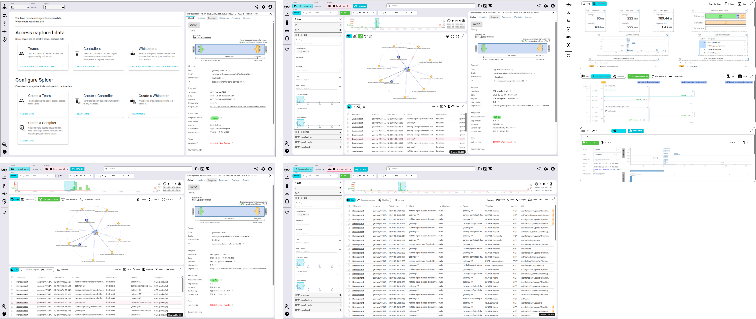
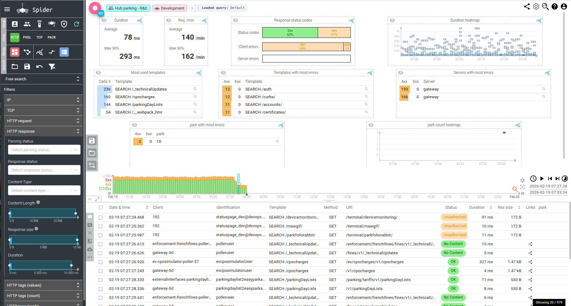
Before and after
The transformation is visible in the screenshots.
Before: navigation on the left sidebar, filters always visible, dense layout.
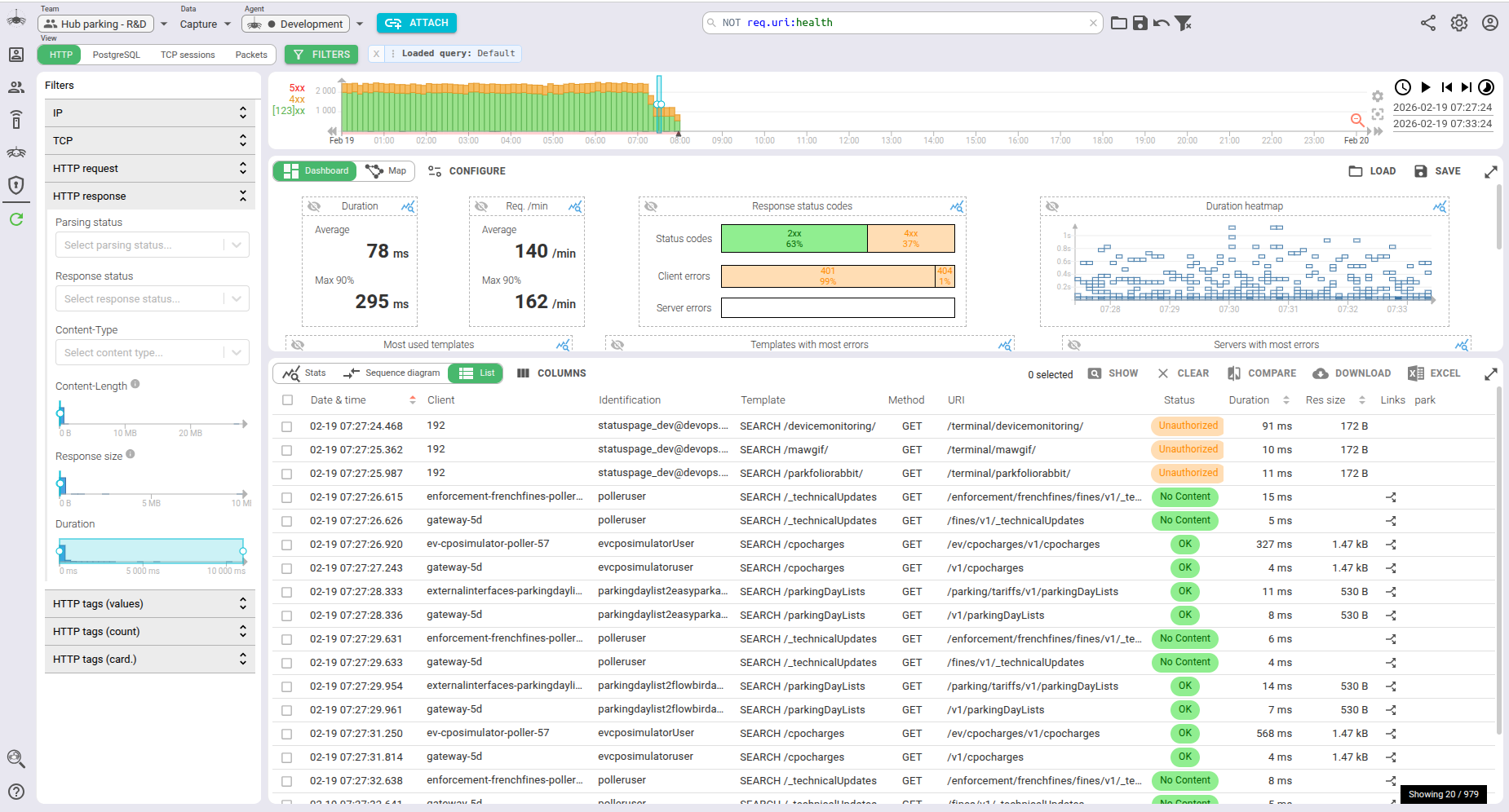
After: top navigation bar, collapsible filters, expanding search, more room for data.
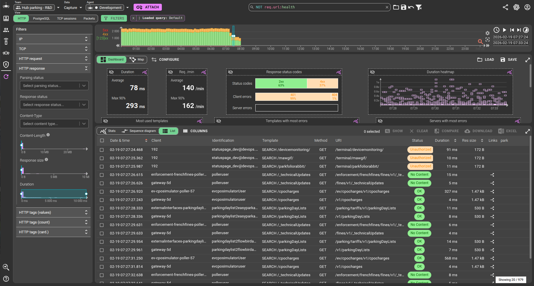
Dark mode was not forgotten.
The before/after delta is not just cosmetic. The top bar frees up the entire left column for filters — which are themselves collapsible, so users who don't need them get the full width for their grids and timelines. The search bar is no longer an afterthought.
What this project revealed
Two things stood out.
AI collaboration at design time is underused. Bouncing the draw.io wireframe off multiple models — Gemini for layout critique, ChatGPT for interaction patterns — produced a better design than any single round of feedback would have. The friction of iteration is low when the artifact is a diagram, not code.
Claude Code's ability to use the browser changes the loop entirely. The classic AI coding workflow ends with "here is the code, good luck testing it." Claude Code with Playwright closes that loop. It can observe the rendered result, notice that a button is 4px off, and fix it without being told. That capability reduced the human-in-the-loop overhead on visual work to something approaching zero for the straightforward cases.
The UI rework took roughly a month of evening work. The AI contribution was real and substantial — not just boilerplate generation, but genuine design iteration, module implementation, and autonomous visual testing. What remains of the "human work" is increasingly the decisions about what to build, not how to build it.
The new UI is now the default. If you prefer the previous layout it is still available in Settings → Display tab. And if you have feedback — positive or critical — contact me!