156 posts tagged with "features"

View All Tags

Close on click on grid and sequence diagrams

One min read

Do you fancy a quicker overview of items content? Without having to get to this remote close icon to close the detail panel?

Thanks to Bertrand who kindly ask for it, it is now easy :)

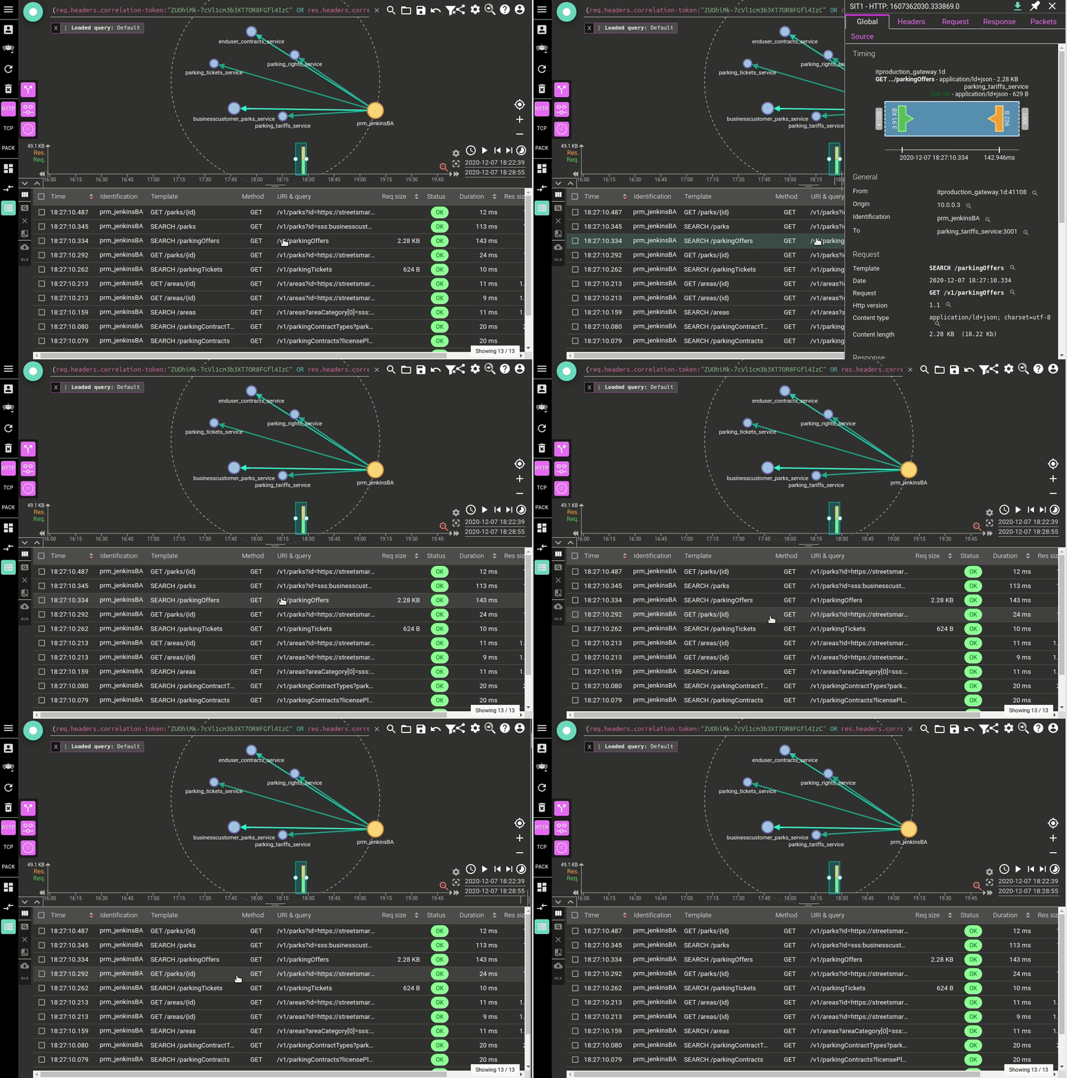
  • Clicking on the grid opens the details
  • Clicking again closes them !

Demo:

Talk to your doctor, it is better for your health to save those pixels of mouse movements ;)

For consistency, the same applies for sequence diagrams! Of course :)
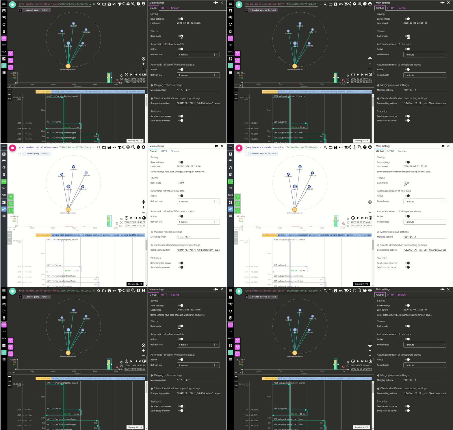
Dark theme is here !!

One min read

Thanks to new Material UI features, I introduced the dark mode into Spider UI. One click in the settings, and you're ready for your long night work ;-)

Groovy :) !!

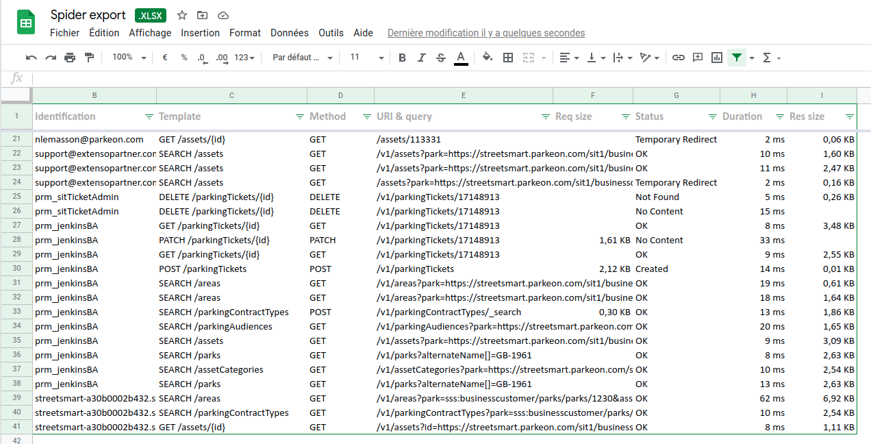
Excel export

One min read

Another Bertrand request: you may now export the grid to an Excel file. All settings made to the grid are transferred to the Excel output:

  • Selected columns
  • Size of columns
  • Duration unit
  • And nice formatters

It is ready with predefined filter area and some metadata from the current search filters on Spider.

Fullscreen grid / sequence diagram or stats

One min read

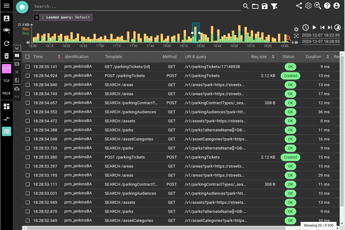
Again, Bertrand raised the fact that the map of the network is not needed for certain use cases. He asked if there was a way to hide it and go full screen for the grid.

Here it is ;) ! You may now enlarge the bottom drawer to the full height of you screen (minus search and timeline).

HTTP duration in milliseconds

One min read

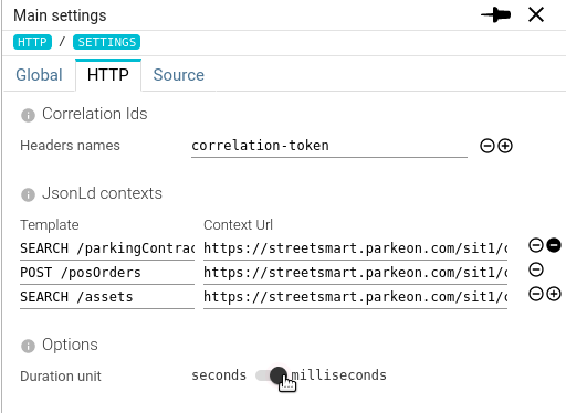
Requested by Michal K, Bertrand and who else, I added the possibility to choose the unit for the HTTP durations, between seconds and milliseconds.

I may look simple, but it impacts many places where i had to inject a single component (hopefully) to update all at once:

  • Grid
  • Sequence diagram
  • Details tab
  • Diff tab
  • Filter histogram
  • Map tooltips and arrow legend

React feels like magic: all are updated with a single switch :-D

I did not do it in stats. Too much work in current stats framework for low value.

Neater breadcrumb

One min read

As considered in Streetsmart, showing the resource name in breadcrumb is not always the聽 best, especially for generated resources.

Thus I improved the breadcrumb of Spider to display name of resource only when intelligible, and by always keeping first and previous item accessible

Try and tell me what you think! :)

Tags rework & use case - Filter on Park identifier !!

One min read

I rework Tags features to merge request and response tags into one result. Indeed, after using it, it offers better UX.

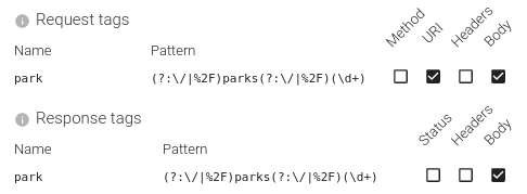
For instance, in Spider, you may defined Park id extractor:

These regular experssions will instruct Spider to extract the internal id of the parks referenced in the communications, and to save them in park Tag.

Spider will then, when parsing, unzip the communications, run the regular expressions and extract the values.

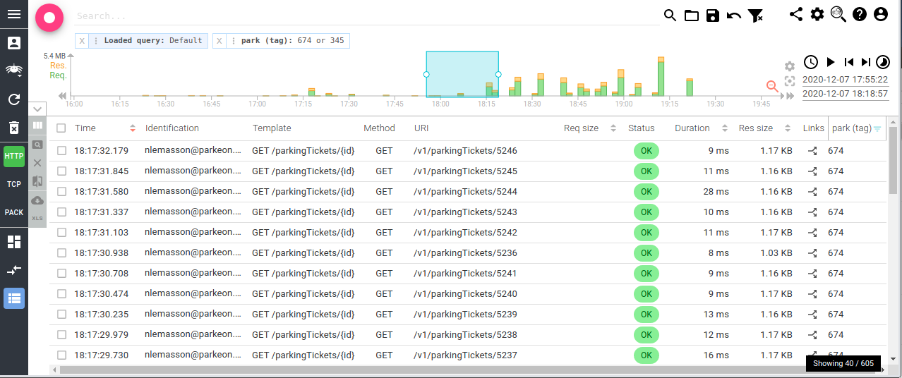
The park column can then be added to the grid and filtered. Thus adding a nice filtering criteria when working!

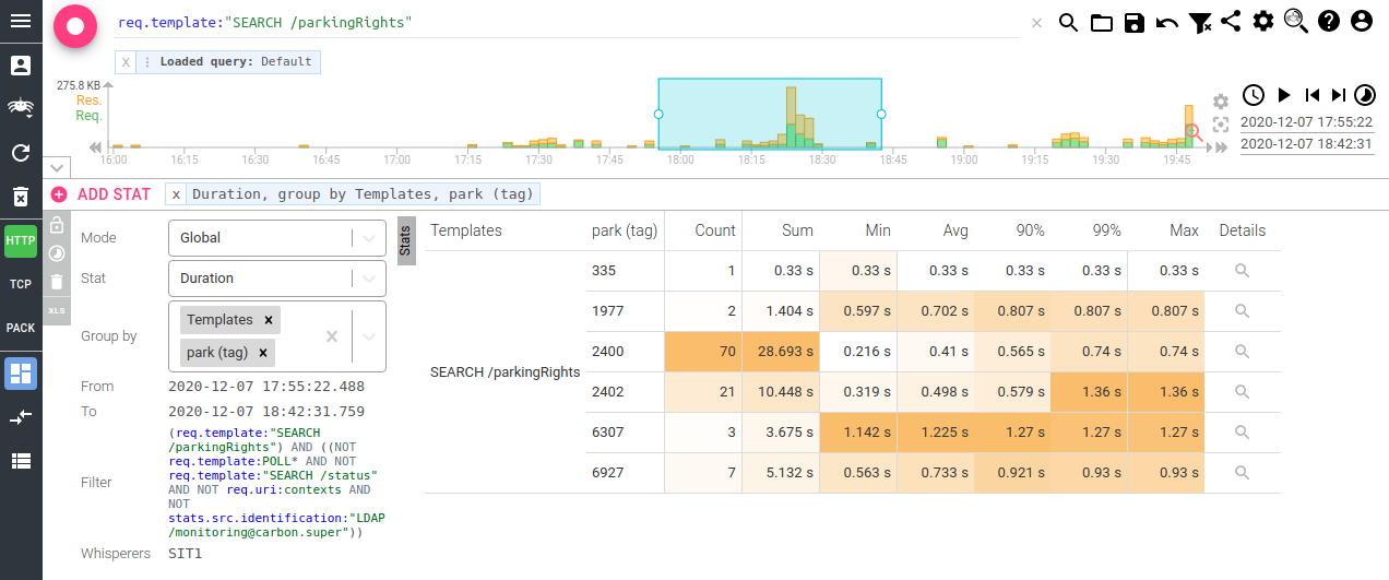
Last, but not least, you may even do stats! For instance, let's compare the latency of parkingRights call depending on the park configuration:

That's amazing !! :)

Visual help - resize handlers

One min read

As requested by Bertrand (he had a lot of inspiration ;) ), I added resize handlers so that the resizing capability of panels is more visible.

I also improved drag and drop speed where I could by postponing store changes to a local state while dragging and using Memoization of components.

Monitoring GUI upgrade

One min read

I started a BIG and LONG task: removing the technical debt on the UI side:

  • Libraries updates
  • Moving React to function base and hooks whenever possible
  • Refactoring
  • Material UI upgrade + CSS-in-JS + theming approach

First application to be reworked: Monitoring UI. It allowed me to start with a full application, while doing common components with Networkview, while not struggling with the complexity of the latter one.

Timeline component was refactored too (https://www.npmjs.com/package/@spider-analyzer/timeline), which leads to a much easier maintenance :)

The result being not so much visible (apart in the code), I took the opportunity to introduce one feature while doing it: the dark mode. Often requested by users, and being facilitated by MUI theming :)

Here it is:

Dark mode can be activated in the settings.

... Now, let's get this work to NetworkView UI !

Filters as tags

2 min read

I got the idea when working on U/X design for Flowbird products:

  • How to be more 'user friendly' with filters and query
  • How to show all active filters in a 'nice' way

I figured out that I could avoid adding all filters visible in the UI query component, and display all filters one by one as tags on the UI. This even brought the possibility to add modification options:

  • Deactivate the filter
  • Invert it
  • And of course, edit the filter in the query

Outcome

After much refactor and UI development, here is the result:

  • Filters are displayed as tags at the top left of the screen.
  • Filters are displayed with as much 'functional' labels and value as possible

  • Filters can be removed from the set with their close button

  • Filters can be deactivated, invert (include or not), manually edited
  • When saving a query, all filters and tags are saved with the query

  • A loaded query can be broken down again in the previous filters for edition

The feeling is really great. It is easy to load a query as default filters, then search, drill down to the selected items. Then cancel some filters and search for something else.

Play with it, tell me what you think! :-)

Menu disposition change

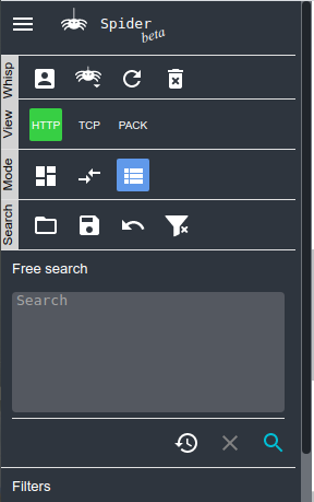
Due to the lower importance of the free search now - a filter as others -, the save/load query, undo and clear filters (new icon) buttons have been moved to a dedicated tool bar.