Cluster Map
Concept
The map is a dynamic aggregated representation of all workloads communications currently filtered.
It displays the Kubernetes workloads and their communications.
It tries by itself to find a stable state to display everything.
You may however move and position all workloads, namespaces and nodes as it best suits you.
The map uses various visual markers and variants to help getting an overview of the situation at a glimpse.
The map uses the ‘view options’ to simplify understanding.
The Cluster Map is available only on Network Usage views: LOG, PHY...
Access
You may switch the top panel between Map and Dashboard from the top panel tabs.
![]()
Layout
Startup
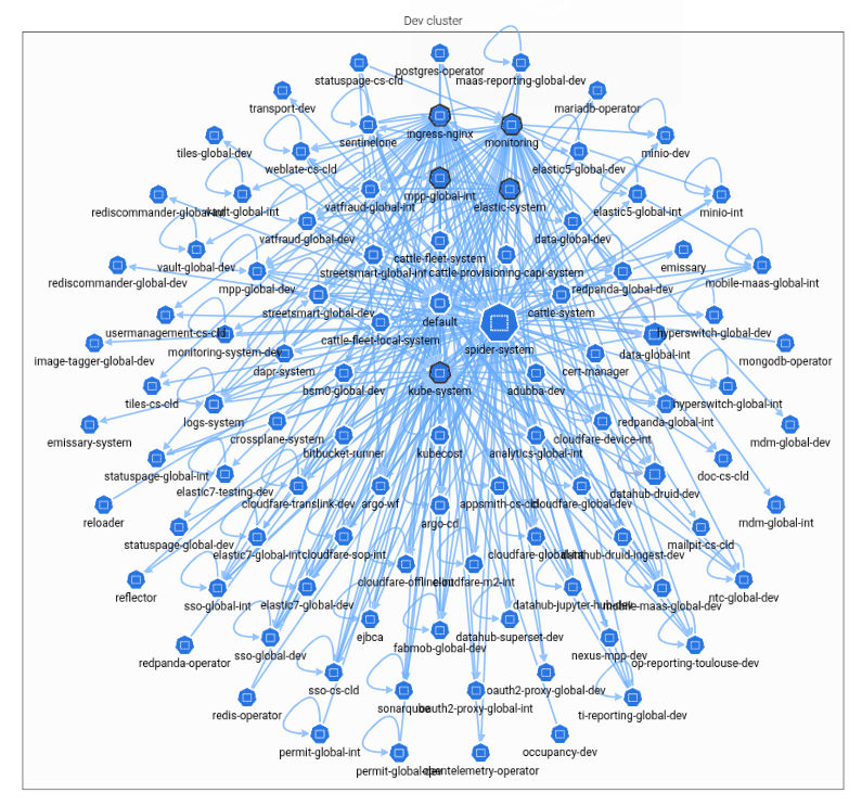
When starting up, there are often too many details to show the global map.
Spider uses a different query when no filter is selected to show a fast high level view.
Logical view
The startup logical view shows all namespaces the user has access to, in collapsed representation and their network communications to other namespaces.
Physical view
The startup physical view shows all nodes, in collapsed representations, and their communications.
It may give nice figures!

Drilling down
Filter the data to reduce the data set.
Logical view
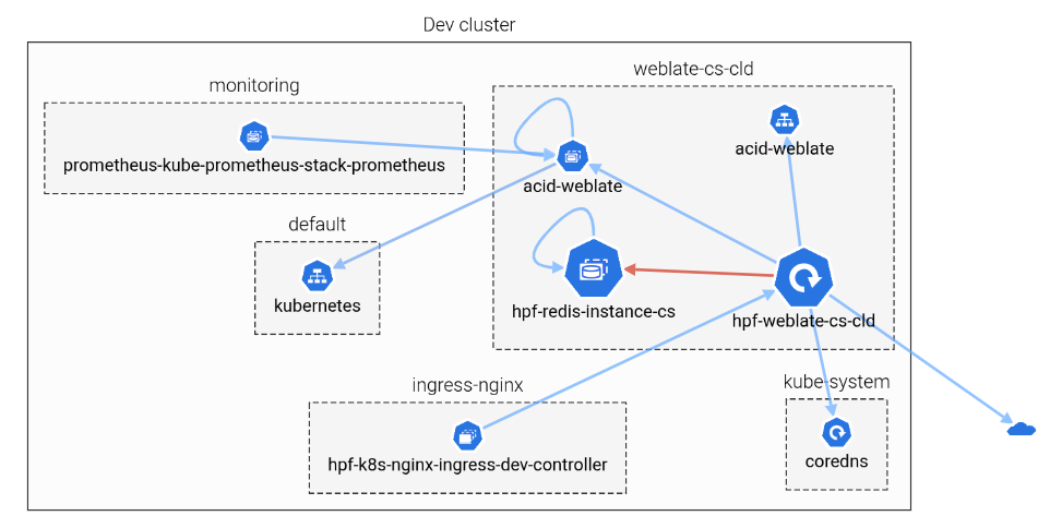
This logical view filters on a namespace.
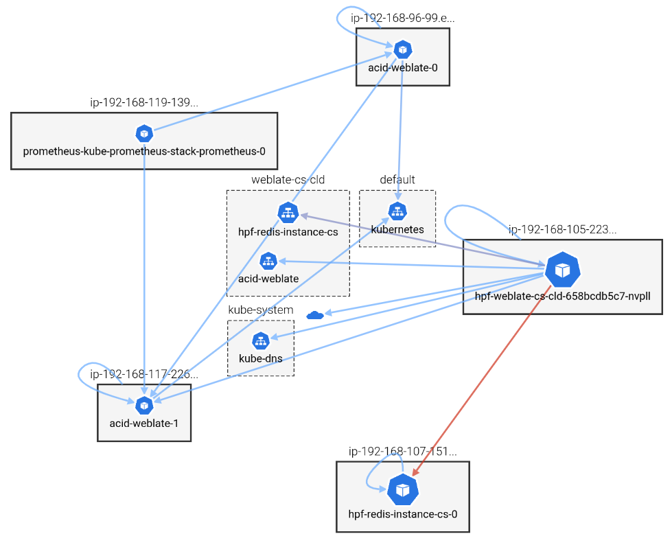
Physical view
The same namespace in physical view (apart from the ingress, to avoid displaying all nodes).
Content
Workloads
- Workloads are blue with official Kubernetes icons
- The bigger the workload, the more data has been transmitted
- When there are more than 10 workloads in a non-selected namespace, they are aggregated in a single namespace icon, with the count of aggregated workloads
- Special icons are used:
internalsIPs, not identified, are represented as a Kubernetes logoexternalsIPs are represented as a Cloud
Links
- The arrow goes from client to server
- The more red the arrow, the more data has been transmitted
- The total of bytes exchanged is displayed on the link being hovered.
Maps actions
Move workloads, namespaces, nodes and cluster
- All may be manually moved by drag and drop
Pan & Zoom
- Map may be zoomed in / out by mouse scroll
- Map may be moved by drag and drop outside of any rendered objects
Select a namespace
When clicking on a namespace, the latter is added to the selected namespaces.
If its workloads where aggregated, they are all shown now.
Select a node
When clicking on a node, the latter is added to the selected nodes.
Filtering out
You may filter out (remove from selection) elements by doing CTRL+Click on them.
It works for:
- Workloads
- Namespaces
- Nodes
You may also avoid displaying some details to clean a crowded display. See the view options below.
Tooltips
Tooltip contents
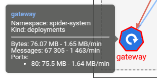
When moving the mouse over a node or a link, a tooltip appears after a while.
The tooltip shows:
- The identification of the workload
- Its global statistics in exchanged bytes and network messages. Total and load/min.
- It's statistics in exchanged bytes per TCP server port.
View options
![]()
Four options are available to customise the map content.
- Internals - Kubernetes icon - Show exchanges with unidentified internal IPs
- Externals - Cloud icon - Show exchanges with external IPs
- Nodes - Node icon - Show exchanges with Kube nodes IPs
- Intra namespaces - Namespace icon - Show intra namespaces exchanges
Progressive loading
The Map is loaded progressively using pagination behind the scene.
When Spider expects to load many data, it shows a progressive loader in a dialog.
You may stop the long loading if you consider that you should restrain the range of data.

Loading exchanges of a wide cluster may be very long.