User Interface composition
Design
Spider UI is a Single Page Application from where you may configure, browse data and perform analysis.
Spider user interface is rich.
It is designed for professional usage to provide you all tools at hands with a no need to get through menus and options. The density of components is high, but it offers much working area on standard desktop screens.
Composition
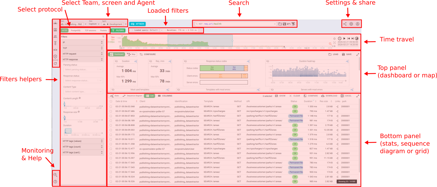
Spider screen composition is represented below:

The screen is composed of:
- Management / configuration tools on the left
- The top navigation bar — Team/Data/Agent selectors, View tabs, FILTERS toggle, Search bar, action icons
- The filters panel on the left (collapsible, toggled via the
FILTERSbutton) - Various actions on the top right
- Some lesser used actions on the bottom left
- Monitoring access
- Help
- The time travel at the top
- The top panel below
- The bottom panel at the bottom
- And, when a specific entity is opened, the detail panel on the right
Customize your view
The composition is dynamic and adapts to your screen width. The position of elements adjust by themselves:
- Active filters are shown below the search bar at the top.
- Panels height or width may be adjusted to your liking.
- You may also enlarge totally the
top panelor thebottom panel, depending on your needs. - The
filters panelon the left can be toggled open or closed with the FILTERS button.
Save your screen customization
Any customization that you do is automatically and continuously saved in your users settings.