Top Panel
The top panel shows aggregated information on the data selected.
It is dynamic and takes into account:
- Selected Whisperer(s)
- Selected time range
- Active filters
It is showing either:
- A dynamic network map of the communication
- A dynamic statistics dashboard
Both with man drill down capabilities.
The Network Map
The Map is a dynamic aggregated representation of all communications currently filtered. It displays the network of nodes - servers and clients - and their links - communications.
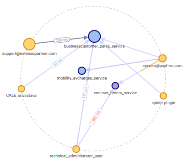
Nodes
- Servers are blue
- Clients are yellow
- The bigger the node, the more data has been transmitted
- The more red the node, the more errors happened (client / server)
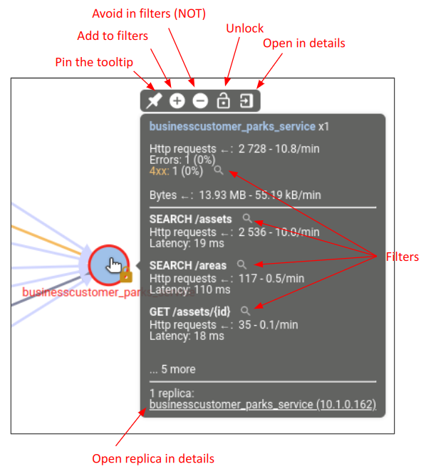
- Nodes tooltips provide many aggregated statistics on the communications in and out of the node
- Clicking on a node adds a quick filter to filter all communications in and out of the node
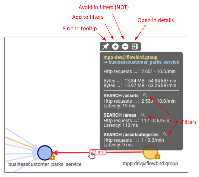
Links
- The arrow gets from client to server
- The stronger the arrow, the more data has been transmitted
- The link line is color splitted in proportion of success, client errors and server errors
- The average latency is displayed on the n slowest links, the more red, the slower.
- Links tooltips provide many aggregated statistics on the communications with same client and server(s)
- Clicking on a link adds a quick filter to filter all communications with same client and server(s)
Map actions
- Nodes may be manually moved by drag and drop
- Once moved, the node has its position ‘locked’ - only for the user
- A node may be unlock by clicking on the yellow lock icon.
- Map may be zoomed in / out by scrolling or with the map actions buttons
- Map may be moved by drag and drop anywhere in the map
The Dashboard
The Dashboard features many different data, aggregated or not, corresponding to the current selected and filtered data.
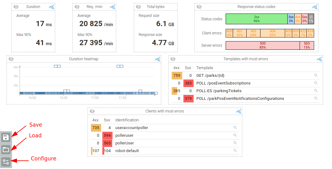
It is:
- Customisable, in content and disposition
- Dynamic as any filters applies to it
- Responsive
And its disposition may be saved and reloaded so that you may have various 'predefined' dashboards.
Widgets
The dashboard is composed of widgets.
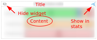
Widgets have all the same structure:
- A title at the top
- A content in the middle
- A top left button to hide them
- A top right button to open the stats bottom panel with more data on the content
Most widgets also have internal filters inside the content that allows fast drill down and focus.
With them, you may filter on data (click) or ignore data (ctrl + click), as for any other filters in Spider.
Dashboard configuration
Dashboard configuration is accessible from the bottom left button of the dashboard.
It opens a right panel where you may:
- Select widgets to display
- Change disposition of widgets
- Remove widgets from your selection
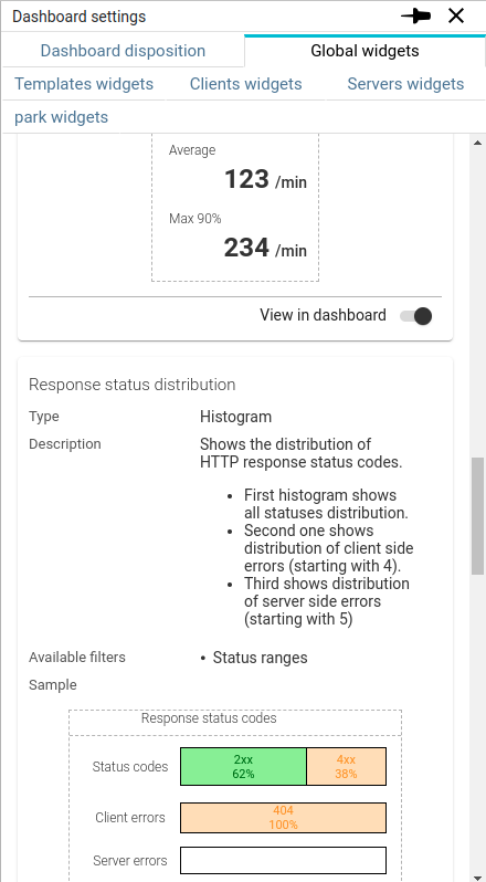
The first tab shows all selected widgets to customise their disposition.
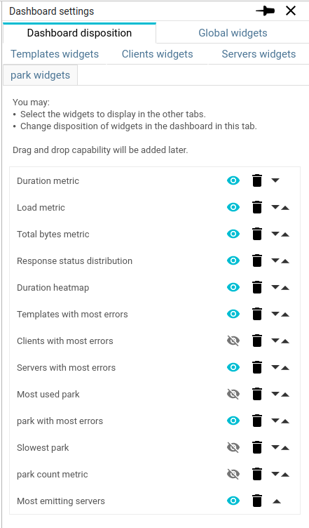
Each subsequent tab shows a widget list with widget descriptions, sample and selection toggle.