Applicative cluster status
Description
This dashboard provides a view on the processing of Spider: the quality of operations and the performance of Spider services.
Screenshot
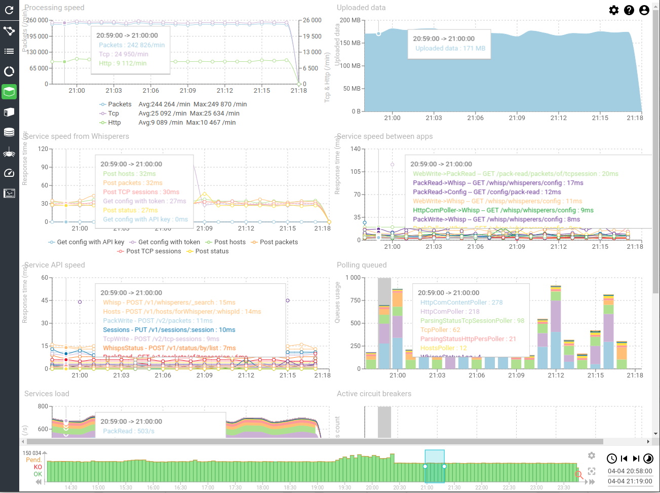
Content
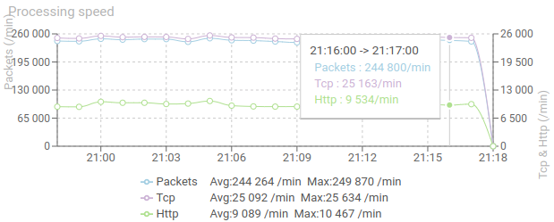
Processing speed (timed chart)
Shows the raw processing speed of Spider:
- Evolution of input load from Whisperer per min: Packets & Tcp
- Evolution of Http communications created
This graph includes average and maximum statistics aside the legend.
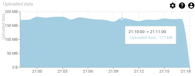
Uploaded data (timed chart)
Shows the evolution of the total uploaded data from Whisperers over time.
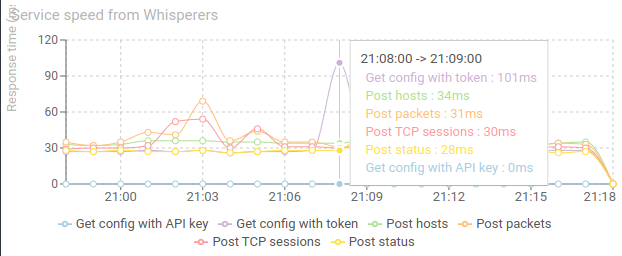
Service speed from Whisperers (timed chart)
Shows the evolution of response time of Spider endpoints, as seen from the Whisperers point of view.
- 30 ms is what you would expect on local network / same Availability Zone.
- The lower, the better.
If the response time is bad add more service replicas or server nodes as needed.
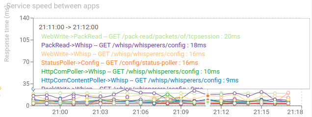
Service speed between apps (timed chart)
Shows the response time between services in the cluster, as seen from the callers.
- The lower the better
- The most stable the better
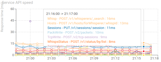
Service API speed (timed chart)
Shows the response time of each service APIs, as seen from the service.
They are usually lower than service -> service metrics, since they do not include network and caller's own processing.
- The lower the better
- The most stable the better
If the response time is bad add more service replicas or server nodes as needed.
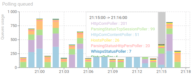
Polling queued (timed chart)
Shows the count of items in Redis queues, waiting for serialization in ES.
- The more stable the better
If it increases, more pollers replicas are needed, or more ES indexation power/threads.
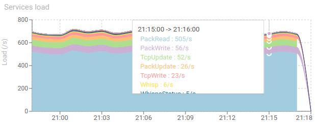
Services load (timed chart)
Shows the load of requests by second of each of Spider services.
Mainly informative.
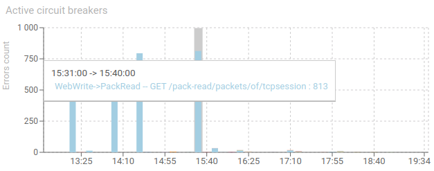
Active circuit breakers (timed chart)
Shows opened circuit breakers over time.
A circuit breaker is opened when communication from a service to a dependency (datastore or another service) is not successful.
A circuit breaker opened will stop the communications between the bricks for some seconds before retrying to communicate.
- The graph should be blank (no vertical bar)
A vertical bar means that there has been a network / infrastructure / configuration issue. And it should be looked at / fixed.
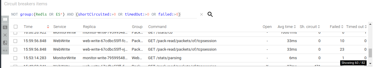
Circuit breakers items - items grid
List circuit breakers status over the period.
- Preconfigured to display only those between applications, and with errors.
It lists precisely what communication is failing, and how many times.