Monitoring Spider
Spider being built with microservices, we needed good monitoring dashboards to understand what was going on, and to troubleshoot issues.
We first started with custom Kibana and Grafana dashboards, but it was not possible to get all information or representation that we needed. And it was tough to get the cluster status at one glance.
Dashboards details
So we designed our own monitoring dashboards. And implemented them. There are various dashboards to monitor Spider:
- Status summary - Summary view of the full cluster at any time.
- Server and UI logs - Server and UI side logs with aggregated views.
- Parsing status - View on parsing speed and quality.
- Applicative cluster status - Status of the applicative processing of Spider: speed, uploaded volume, service load, queues...
- Servers status - Status of the servers, the containers and the datastores: CPU, RAM, disk...
- Datastores status - Status of the datastores: response time, speed, load, size, and circuit breakers...
- Gociphers status - Status of the gociphers: state, uploaded secrets, cpu, ram, queues, circuit breakers...
- Whisperers status - Status of the whisperers: state, uploaded data, quality of parsing, cpu, ram, queues, circuit breakers...
- Spider performance - Raw performance of all APIs, connections.
- UI usage status - History and statistics of UI connections.
How it works
Microservices
Monitoring data is collected via different ways:
monitor-writeservice, that collects Spider service stats- Elastic
filebeatcomponent, that collects logs - Elastic
metricbeatcomponent, that collects hardware, docker and Kubernetes metrics
The data are exposed through a single monitor-read service.
Some others services like sessions are used directly for specific dashboards.
Metric collection flow
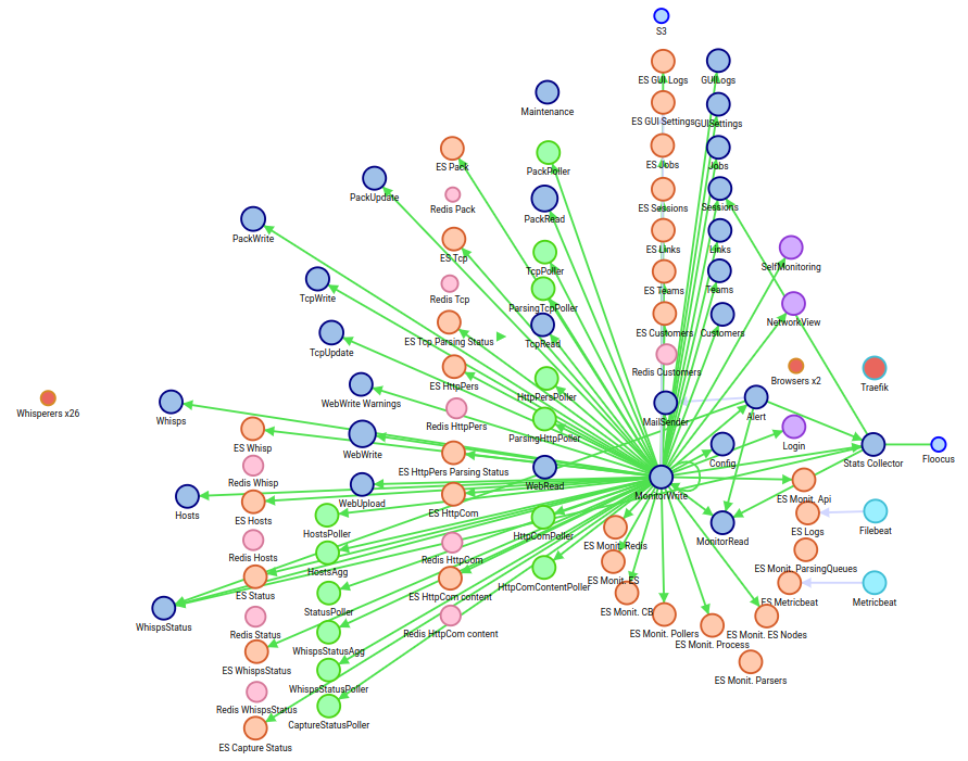
- The
monitor-writeservice is calling all replicas of all services at regular interval to get their statistics, and save them in their corresponding indices. MetricbeatandFilebeatare writing to their specific indices.- Also, Whisperers are sending statuses on their own.
Access to the dashboards
URL
The monitoring dashboards are available by default in Spider installation.
They are deployed under the root endpoint at https://{your domain}/{your proxy}/self-monitoring address.
You need to be authenticated and have authorization to access them.
Thus, being protected, they are exposed alongside the analysis UI.
![]()
UI access
You may also access them from the analysis UI with the monitoring icon on the top right.
The icon is visible only if you have access rights to the dashboards.

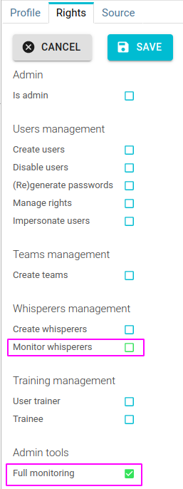
Access rights
To access Spider monitoring, you need specific rights:
- Administrative monitoring: access to all dashboards, for people managing the platform.
- Whisperers monitoring: access to Whisperers status dashboards, for people managing a set of Whisperers.
Common components
Timeline
All dashboards include the same Spider timeline as for the analysis UI, with zoom, pan, selection... and different flavors. By default, the TCP parsing status flavor is displayed, as it is the main quality indicator of Spider health.
A specific timeline, with different lifespan and flavors exists for UI usage status.

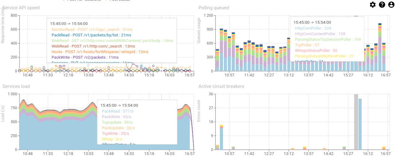
Charts
Dashboard includes many charts.
Charts are either:
- Timed charts, which are plotted over the time in x axis.
- Aggregated charts, which are plotted against another dimension, such as time spent on each whisperer.
You may zoom in time by clicking and dragging on the charts themselves, to focus on some time range.
All charts as well as time selection in the timeline will be adjusted in consequence.
Visual synchronization
The different charts of each dashboard are synchronized and rendered with the same x axis so that it is easy to correlate the information of each graph.
When moving the mouse over the charts, a tooltip is displayed on each chart with the related data of each chart at this time.
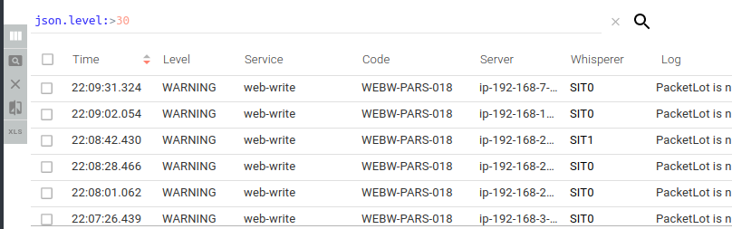
Grid
Many grids are visible in the dashboards.
They are reusing the analysis UI component. And allow:
- Filtering, with syntax highlighting and fields autocompletion.
- Columns selection and resizing
- Items sorting
- Items selection for diff comparison (in JSON)
- Excel export of the grid
Grids are showing items from two kind of sources:
- Items grids are showing raw items as they are stored in the store: logs...
- Aggregated grids are showing and aggregated view on some axis. Ex: count of logs by code.
Detail panel
As for the analysis UI, clicking on any item in a grid opens the linked resource / aggregation in the detail panel.
Most often, only the JSON view is available for now.
Dashboards
The content of each dashboard is explained in the linked pages.
Monitoring remote agents
Remote agents as Whisperer, Gociphers and Controllers are regularly sending their status to Spider.
To monitor them, you may:
- Access their unitary status through their dedicated Details tab in the Analysis UI.
- Access the evolution of their status in the dedicated Whisperers and Gociphers screens in the monitoring UI.
- Access their logs from the Controller deployed in their cluster.
- only available in Kubernetes.